
Design trends, legendary masks, and what makes a great paint job stick in people’s minds.
No other piece of equipment in team sports gets treated the way a goalie mask does. It’s the one place on a player’s body where personal expression isn’t just allowed, it’s expected. Fans who couldn’t tell you a single save percentage can still picture specific masks from thirty years ago. That’s not branding. That’s something else.
This page traces how it got there: the masks that changed what people thought was possible, the themes that keep coming back, and what the craft looks like today.
Goalie mask design didn’t start as an art form. When Jacques Plante first wore his fibreglass mask in a game in 1959, it was flesh-toned and functional. The design conversation hadn’t started yet because the argument over whether to wear a mask at all was still very much ongoing.
The first real personality appeared by accident. In 1967, Boston Bruins goalie Gerry Cheevers got hit in practice and had trainer John Forristall draw a stitch mark where the puck connected. They kept adding one every time another shot landed. By the end of his career, the mask was covered in black marker stitches and had become one of the most recognizable images in hockey. What started as a joke became a tradition.
Colour came next. Doug Favell of the Philadelphia Flyers had his mask painted bright orange for a Halloween game in 1970. Shooters told him afterwards the colour caught their eye before anything else on the ice. By the mid-1970s, Ken Dryden’s Canadiens target mask and Gilles Gratton’s tiger face with the Rangers showed the mask had fully become a form of identity.
By the 1990s, carbon fibre and Kevlar had refined the combo mask into the standard you see in NHL locker rooms today. The shape stabilized, and artists got serious about what went on top of it. The old-school airbrush tradition that started with hand-laid designs on fibreglass shells evolved into a full professional craft, with dedicated studios producing work for players at every level of the game.
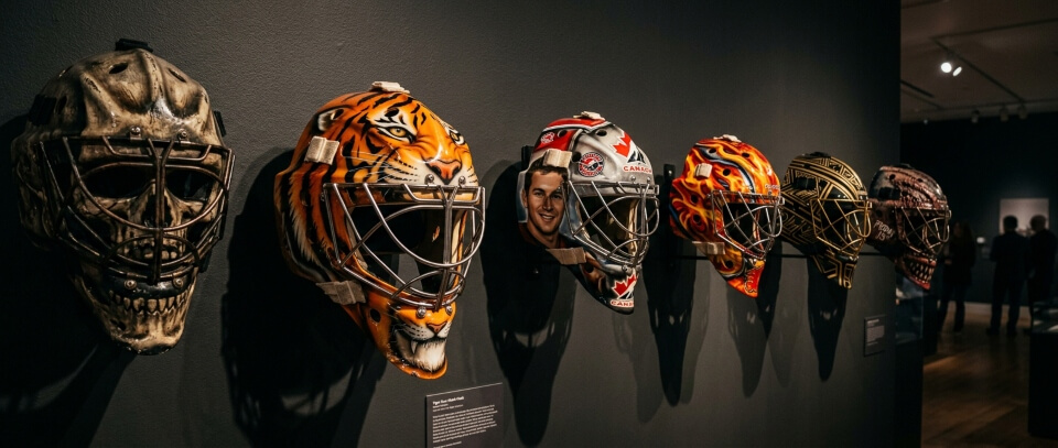
The single-piece fibreglass masks from the 1960s through early 1980s are the most collected in hockey today, and the designs from that era established archetypes that artists still reference. Three masks in particular set the template for everything that followed.
Goalie & Era | Why It Matters |
|---|---|
Gerry Cheevers, 1967-72 (Bruins) | Stitches drawn on by accident. The first mask with real personality. Still the single most referenced design in hockey history. |
Gilles Gratton, 1976-77 (Rangers) | Tiger face after a National Geographic photo. Shifted what people thought a mask could look like. Now in the Hockey Hall of Fame. |
Gary Bromley, 1980-81 (Canucks) | Full skull design on a fibreglass shell. Played off his nickname Bones. One season, one image that outlasted most of what happened on the ice those years. |
Mike Palmateer, 1970s-80s | Among the first generation of goalies to embrace elaborate colour work. His masks are frequently cited as early examples of old-school airbrush craft at its best. |
Design note
These designs established three recurring archetypes: the team-identity mask, the predator mask, and the character mask. Most designs since then fit somewhere within those categories.
By the 1990s, professional mask artists had developed a set of technical approaches that are still the foundation of high-end custom work today. The three most common are biomechanical, portrait, and team-theme design.
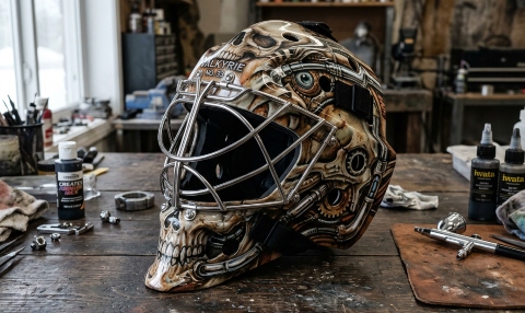
Biomechanical designs combine organic and mechanical elements, typically layered over a skull or skeletal framework. The style draws from H.R. Giger’s work and became mainstream in mask art during the 2000s. Carey Price’s Mechanical Skull, commissioned from Jordon Bourgeault of JBo Airbrush in Calgary, is one of the best-known recent examples. The level of detail involved in work like that is why some NHL goalies pay out of pocket for special-edition masks when the team budget doesn’t cover what they want.
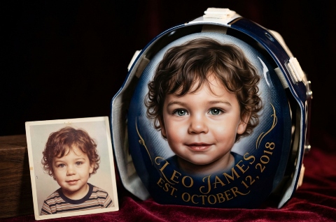
Portrait commissions involve painting realistic likenesses, usually family members, on the back plate or main shell. These are the most technically demanding masks to produce, and artists who specialize in them often have backgrounds in fine art. The back plate has traditionally been reserved for personal content: birth dates, family names, tribute text. For Heritage Classic or Stadium Series games, some goalies extend this to the full shell.
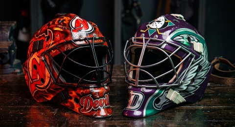
Team-theme masks build the whole design around the franchise’s colours, logos, and identity. Martin Brodeur wore this style throughout his career in New Jersey. Guy Hebert’s Duck Wings mask with the Anaheim Mighty Ducks worked so well that multiple Ducks goalies have carried the same basic concept forward since. A design that reads as a tribute to the franchise tends to age well within that fan base, even after the player is gone.
A few designs stand out for how far their influence reached and how long they’ve stayed in public conversation.
Curtis Joseph (Cujo mask): First worn with St. Louis in 1989, painted by David Arrigo. Joseph kept the same snarling dog concept through every organization he played for over 19 years. The mask became more recognizable than his face.
Ed Belfour (eagle): Belfour went in wanting a hawk. The artist suggested an eagle would read better from a distance. Todd Miska eventually became the artist behind it, and the eagle followed Belfour through Chicago, San Jose, Dallas, Toronto, and Florida. Four teams, one bird.
Felix Potvin (Maple Leafs design): The Felix Potvin mask is interesting for what it doesn’t have on it. His nickname was The Cat, but there was never a cat on the mask. Sylvie Poitras built the design around Maple Leafs colours on a custom Warwick shell, clean and symmetrical. Beer-league goalies still replicate it today.
Jaroslav Halak: The Jaroslav Halak mask designs he wore during his time with Montreal and later teams attracted wide coverage. His masks were frequently cited in sports media as examples of high-end custom airbrush work, with multiple versions documented publicly during his career.
Connor Hellebuyck: Connor Hellebuyck has worn a series of distinctive mask designs during his time with Winnipeg, several of which generated significant attention in hockey media. His masks typically combine predator imagery with team colours in ways that photograph well at a distance.
Wyatt Waselenchuk: A standout custom mask commissioned for Waselenchuk, a goaltender who played college hockey at Minot State, drew attention in sports media as an example of high-end airbrush work produced for players outside the professional ranks. The design demonstrated that the craft had fully reached the amateur and collegiate level.
Keith Kinkaid: Kinkaid wore several distinctive designs during his time in the NHL, a few of which circulated widely in hockey media. His masks are among the names that come up regularly in collector and fan discussions of modern custom work.
The shell a goalie chooses affects what an artist can do with it. Different manufacturers build their shells with different geometries, vent placements, and surface textures, all of which influence the painting process.
The goalies whose masks are still remembered decades later generally had one thing in common: the design connected to something real about them. The most effective starting points are usually personal rather than generic.
On intimidation
Intimidation is often cited as the goal of a painted mask, but the designs that hold up longest in collective memory aren’t always the scariest. Cheevers’ stitches, Dryden’s target, and Potvin’s clean team-colour design are all relatively calm images. What they share is clarity and connection to something real about the goalie who wore them.
Depends how you define it. Plante’s 1959 mask had a flesh-toned coating, so technically the first coloured one. Favell’s orange Flyers mask in 1970 was the first deliberate use of colour for effect. Rutherford is often credited as one of the first to commission an actual design. Cheevers’ stitches, added informally in practice from 1967 onward, are generally considered the first mask with real personality.
Single-piece fibreglass masks from the 1960s through early 1980s, particularly anything worn by a well-known goalie of that era. Cheevers, Dryden, Gratton. Game-used condition with documented provenance is what drives the price at auction.
Sportmask is a Canadian shell manufacturer whose Profile-style design became the standard in NHL locker rooms. When people reference the sportmask by name, they’re usually talking either about game-used collector examples or about the shell as a platform for custom work.
Usually because the symbol is personal rather than team-specific. Belfour’s eagle and Joseph’s dog both travelled because they were tied to the goalie’s identity, not the jersey. Potvin did something slightly different: same structure, colours changed to match whatever team he was on. Each approach says something different about how the goalie thinks about the mask.
Old-school airbrush refers to the hand-laid design tradition on single-piece fibreglass shells from the 1960s through 1980s. The tools were simpler, the shells less refined, and the artists were often working without established technique references. Modern airbrush work on composite shells uses the same basic tool but with better paints, more precise control, and a much larger body of prior work to learn from. The old-school aesthetic, bold graphic shapes, simple colour palettes, and visible brushwork, gets deliberately referenced by some artists today as a style choice.
Warwick masks are primarily a collector and nostalgia reference today. The shells worn by 1990s goalies like Felix Potvin are well documented in the collector community, but Warwick is not a major current production manufacturer in the same way that Bauer, CCM, or Vaughn are. If you’re looking for a Warwick shell for a custom project, they come up in used and collector markets rather than new production.